
- Printed Journal
- Indexed Journal
- Refereed Journal
- Peer Reviewed Journal


P-ISSN: 2664-6064
E-ISSN: 2664-6072

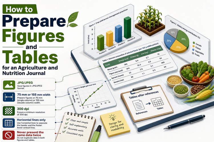
Figures go into the manuscript as JPG or JPEG at 75 mm or 155 mm width and 300 dpi. Tables are placed after the references, use horizontal lines only, and are numbered in the order they are cited. Those are the requirements of this agriculture and nutrition journal, and almost every figure sent back for correction fails on resolution rather than on content.
No agriculture and nutrition journal will print the same data twice, so never present it as both. Choose by what the reader needs to take away.
| Use a table when | Use a figure when |
|---|---|
| Exact values matter | The shape of a relationship matters |
| Units or treatments differ across rows | A trend or a curve is the point |
| The reader may want to recalculate | The comparison is visual |
| There are many variables, few levels | There are few variables, many levels |
Composition of six varieties across four nutrients is a table. Yield response across five nitrogen levels is a figure. A yield response across five levels presented as a table of five numbers is a wasted table, and the same five numbers plotted and tabulated is a comment from the reviewer.
Screen images are usually 72 to 96 dpi. Print needs 300. A chart copied from a spreadsheet and pasted into Word carries its screen resolution with it, which is why it looks acceptable on your monitor and blurred in the printed issue.
The fix is to export rather than copy. In a spreadsheet, save the chart as an image at the required size and resolution, then insert the file. In statistical software, export to a raster format at 300 dpi with the width set to 75 mm for a single-column figure or 155 mm for a full-width one.
Set the width before you export, not afterwards in Word. Dragging a small image larger inside the document does not add pixels; it enlarges the ones it has, which is precisely what produces the soft, fuzzy figures that come back for correction.
The greyscale point catches people out. Three lines in red, green and blue are three identical grey lines once printed. Use solid, dashed and dotted.
Every nutrition journal table needs four things: a self-descriptive heading, the number of replicates, a measure of dispersion, and units in the column headers rather than repeated in every cell.
Weak heading: “Table 2: Results”.
Usable heading: “Table 2: Grain yield, protein content and iron content of three pearl millet varieties under two irrigation regimes, kharif 2025 (means of four replications ± standard deviation)”.
The second heading lets the table stand alone. A reader who meets it out of context — in a database record, in someone's slide deck — knows what they are looking at, which is the test a caption has to pass.
On formatting: horizontal lines only, as this agriculture and nutrition journal requires. That means a line above the header, one below it, and one at the foot. No vertical rules, no grid, no shading.
Where means are compared, mark them with superscript letters and explain the convention in a footnote: means in a column followed by the same letter are not significantly different at p = 0.05 by the named test.
Two habits worth keeping. Name the test in the footnote, not only in the methods, because the table gets read on its own. And apply letters within a column or within a row, never both at once — a table where the reader cannot tell which comparison the letters refer to is worse than a table with no letters.
Number them in the order they are first cited, the same rule an agriculture and nutrition journal applies to references. Figure 1 is the first figure mentioned, wherever it eventually sits. The same applies to tables, and to references, which is one rule fewer to remember.
Cite every table and figure at least once in the text. An uncited figure is either unnecessary or evidence that a sentence went missing during editing, and reviewers ask about both.
In the text, point out what matters rather than narrating the whole table. “Iron content differed between varieties (Table 2), with the highest value in variety C” is enough. Walking through twelve numbers that are already printed below wastes the words the discussion needs.
A nutrition journal accepts photographs, but field and laboratory images need a scale where size matters, and a caption saying what is shown, where and when. If a figure is a plate made of several images, subdivide it with upper-case letters and refer to them as Figure 1A, 1B and so on.
Do not adjust a photograph in ways that change what it shows. Cropping and overall brightness are acceptable and should be mentioned if substantial; selectively lightening one part of a gel or a plate is data manipulation, and a nutrition journal that screens submissions will treat it as such.
Some figures are wrong before any question of resolution arises.
Human eyes compare angles badly. Five slices at 24, 21, 20, 19 and 16 per cent are indistinguishable in a pie and obvious in a bar chart or, better, in one line of text. Pie charts survive in presentations and rarely earn their space in a nutrition journal paper.
Two means with error bars occupy a quarter of a page to convey what a sentence conveys in one line: control 3.42 ± 0.18, treatment 4.18 ± 0.21 t ha⁻¹, p < 0.01. Save the space for a figure that shows something a sentence cannot.
“Figure 3: Effect of treatments” forces the reader back into the methods to decode the axis. A caption should name what is plotted, the units, the site and season, and what the error bars are. Captions are read far more often than the paragraph that cites them.
300 dpi, at 75 mm width for a single-column figure or 155 mm for a full-width one, supplied as JPG or JPEG within the Word file. Set the size before exporting rather than resizing afterwards.
After the references, each with a self-descriptive heading, using horizontal lines only. They are numbered in the order they are first cited in the text.
Yes, but design them so they still work in greyscale, since the print edition may not carry colour. Use different line styles or marker shapes as well as different colours.
Either, provided you say which in the caption and give the number of replicates. What causes confusion is an unlabelled error bar, because standard error bars are smaller and look more favourable than standard deviation bars from the same data.
As many as carry information the text cannot, within the 15-page limit. Papers that arrive with nine tables usually have three that matter and six that belong in supplementary material or nowhere.
Almost always because it was copied and pasted rather than exported. A pasted chart keeps its screen resolution of around 96 dpi. Export it from the original application at 300 dpi and insert the file instead.
How figures and tables sit with the surrounding sections:
Created by Tanvi Bhardwaj • 10 Aug 2026
P-ISSN: 2664-6064
E-ISSN: 2664-6072

International Journal of Agriculture and Nutrition